The fastest way to lose a reader is to give every shopper the same review structure. A mobile scanner wants a verdict almost immediately, a comparison shopper wants proof points they can weigh, and a deep researcher wants enough evidence to trust the recommendation. That's why product review format works better as a layered decision system than as a rigid outline.
Table of Contents
Why Most Product Reviews Fail Before the Reader Scrolls
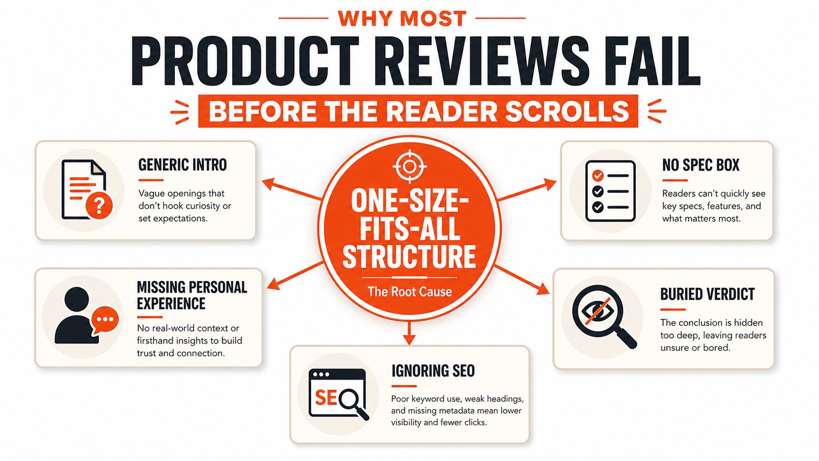
Most reviews fail before the reader gets far because the structure does not match the reading context. A phone user on a commute wants a fast verdict. A comparison shopper wants proof they can scan quickly. A deeper researcher wants enough context to judge fit without hunting for the answer.
Three reader contexts, three different depths
A mobile scanner checks the headline, the opening line, and the final recommendation. If the verdict is buried, the page loses them. A comparison shopper looks for the quick summary, the feature breakdown, and the pros and cons, because that is what makes side-by-side evaluation possible. A deep researcher keeps reading only if the review shows firsthand use and practical evidence.
Practical rule: Keep the same core sections, then adjust how much space each one gets.
That reading behavior is why review format matters so much. The page has to serve fast skimmers and patient evaluators without forcing either group to work harder than necessary. Templates help here. Use SupaBird templates for faster content creation when you want a repeatable structure that still leaves room for product-specific detail.
Reviews also earn more trust when they show visible proof instead of a lone star total. UX guidance favors richer layouts with a decimal average score, the total number of reviews, a ratings distribution chart, unedited product photos, review dates, and signals like helpfulness counts or recommendation counts, because shoppers need more than one summary number to judge credibility (Smashing Magazine). Review-count behavior points the same way, since visible volume influences how quickly readers trust the page (Fera review statistics).
The format is the decision system
The structure has to do more than describe a product. It should let each reader stop at the point that fits their intent and still leave with a clear answer. A scanner needs speed, a comparer needs clean proof, and a researcher needs enough depth to feel confident.
That is why weak reviews feel padded even when they are long. They make every reader do the same work. A stronger format cuts that friction and gives each audience the level of detail it came for.
The Required Sections and Their Word-Count Targets
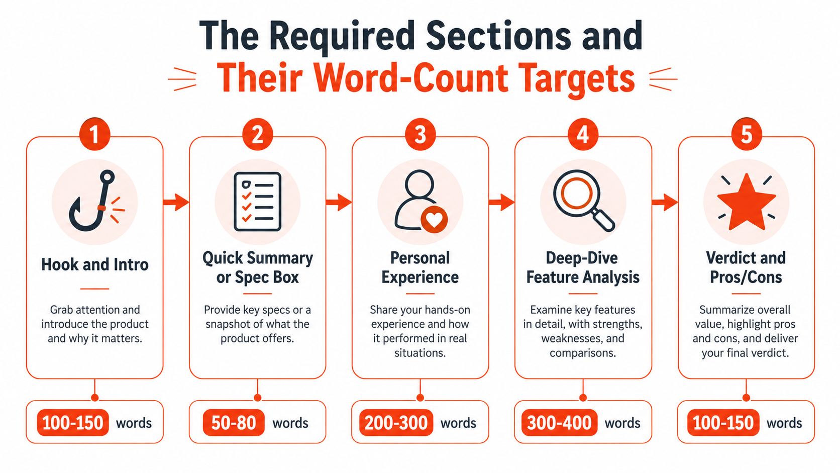
A conversion-ready review needs a narrative arc, not a pile of disconnected parts. The flow that works most often is simple, because each block answers a different reader question in order. The clearest version starts with the hook, then moves to the summary, then proof, then detail, then the verdict.
Build the page from the top down
Hook and intro, 100 to 150 words. This block should tell the reader what the product is, why it matters, and who the review is for. Cut any origin story that doesn't help the buyer decide.
Quick summary or spec box, 50 to 80 words. This is the scan layer. Include the product name, key specs, and one plain-English verdict line so a busy shopper can orient instantly. For more complex products, include pricing plans and licensing terms, since those details affect the purchase.
Personal experience, 200 to 300 words. This section earns trust. Show how you tested it, what changed in real use, and which situations exposed weaknesses.
A good framework like this also matches guidance from product-review templates that emphasize test method, real use cases, pros and cons, who it's for and not for, alternatives, and original visuals (WordPress review template guidance). Miro's review template also points to a structure built around overview, criteria, issue log, user feedback, metrics, action items, and final recommendation, which is why the best reviews feel decision-driven rather than decorative (Miro product review template).
Save the deepest space for features
Deep-dive feature analysis, 300 to 400 words. This page earns rank and conversion. Focus on the features that affect buying, not every menu item or spec sheet line.
Verdict and pros and cons, 100 to 150 words. End with a recommendation that names who should buy, who should skip, and the one-sentence takeaway. Google's review guidance also favors firsthand experience, user perspective, evidence, quantitative measurements where relevant, and comparisons with competing options (Google high-quality review guidance).
If a section doesn't help a reader decide, cut it or compress it.
For a practical shortcut, use templates to speed up first drafts and keep the structure consistent across reviews, then fill in the evidence unique to each product (template workflow note).
Headlines, Hooks, and Verdict Lines That Earn the Click
A review can be structurally sound and still get skipped if the first sentence reads like filler. Headline and hook work is about speed. The reader should know the product, the angle, and the likely outcome before they finish the opening paragraph.
Headline formulas that actually pull weight
A number-driven headline works when the review compares options or answers a practical shopping task. For example, “5 Best Wireless Keyboards for Remote Work” tells the reader what the page covers and why it exists. A benefit-led headline fits single-product reviews better, because it leads with the payoff, like “Notion AI Review for Faster Drafts and Cleaner Workflows.”
Question headlines can work, but they're weaker when the product is already obvious. “Is the Logitech MX Master 3S Worth It?” is fine for search intent, yet it can feel thin if the page doesn't answer quickly. A stronger version is usually more direct, because it reduces friction.
Hooks and verdict lines need to do different jobs
The hook is not the place for a full history of the category. It should preview the result and tell the reader what to expect. A clean opening often sounds like this, “This mouse is comfortable, fast, and easy to recommend for desk work, but its shape won't suit every hand.” That gives the reviewer room to explain why without stalling the page.
The bottom-line verdict should be even sharper. Write for someone who only wants the answer. “Recommended for buyers who want reliable everyday use, not for users who need deep customization.” That kind of line serves the scanner while still signaling nuance.
For headline and hook rewrites, keep the language concrete and remove soft phrasing. A vague opener like “A practical look at a popular tool” becomes “A practical review of a drafting tool that saves time on first-pass copy.” The second version does work.
If you want a reference point for fast hook construction, the hook-writing process at SupaBird's hook guide is a useful model for concise openings that don't waste the first line.
Pros, Cons, and Rating Rubrics You Can Copy
Readers don't trust reviews that sound like sales pages, and they don't trust ratings that feel arbitrary. Pros and cons need to read like evidence, not applause. A simple rubric also helps you explain why the score landed where it did.
Three layouts that work in different contexts
A bullet layout is the easiest to scan. Use it when the page targets mobile readers or comparison shoppers who want a fast answer.
A sentence layout works better when you need to preserve tone. It lets you sound more editorial without hiding the trade-offs.
A scored layout helps when the product has several criteria that deserve different weights, especially in SaaS, creator tools, and hardware.
Criterion | Weight | Score (1-10) | Weighted Points |
|---|---|---|---|
Ease of use | 30% | ||
Value | 25% | ||
Support | 20% | ||
Performance | 25% |
You can fill the card with your own criteria, but the point is consistency. The review should show how the score came together, not just what the final number was.
Make the rubric match the buying decision
For a creator tool, ease of use might matter more than raw feature depth. For a battery accessory, durability might outweigh polish. For a SaaS tool, support and reliability can carry more weight than a flashy dashboard.
Practical rule: Weight the criteria according to what could make the buyer regret the purchase.
Balanced pros and cons only help when balance is true. If a product clearly outperforms in its category, don't force equal praise and criticism. If it fails on a major purchase criterion, say so plainly and leave the score lower. That honesty is what makes the rubric usable on the next review you write.
SEO and Meta Elements That Keep the Review Discoverable
Search visibility starts before the review is published. If the title, slug, and opening do not match the buyer's intent, the page can attract the wrong reader and miss the one who is ready to decide. The goal is alignment, not keyword stuffing, and that starts with reading context. A mobile scanner needs a clean headline and a fast answer. A comparison shopper needs obvious differentiation. A deep researcher needs enough structure to trust the page and keep moving.
Copy-ready meta elements
Use a meta title that names the product and states the angle clearly. A practical template looks like this, “[Product Name] Review, What It Does Well and Where It Falls Short.” Keep the slug close to the search intent, use simple words, and put the product name first.
Write the meta description as a summary of value, not a sales pitch. A clean template is, “A practical review of [product] with hands-on notes, pros and cons, and a clear recommendation for buyers.” That gives searchers a reason to click without sounding forced.
Place the primary keyword in the heading, early in the intro, and where it fits naturally in alt text. Add internal links to related reviews so the page sits inside a cluster instead of standing alone. If you are refining the whole page workflow, a content optimization service like AY Rank's content optimization can help shape those elements without stripping out voice.
Schema, snippets, and search intent
The SEO lift comes from structured data, schema markup, and a page layout that matches how the review might appear in search results. Product review pages should make it easy for crawlers to understand the product name, rating context, and review focus. That does not mean stuffing every possible field into the page. It means giving search systems a clear signal so the review can qualify for richer presentation where it fits.
A useful way to think about it is simple. If the page is meant to answer a fast buying query, the meta title and description should reflect the verdict angle. If it is meant to support a longer comparison, the opening should signal that the review covers trade-offs and use cases. For a specific example of how a tightly structured page can support search intent, the approach in Danny Postma's headshot SEO strategy shows how clear positioning helps a page stay focused.
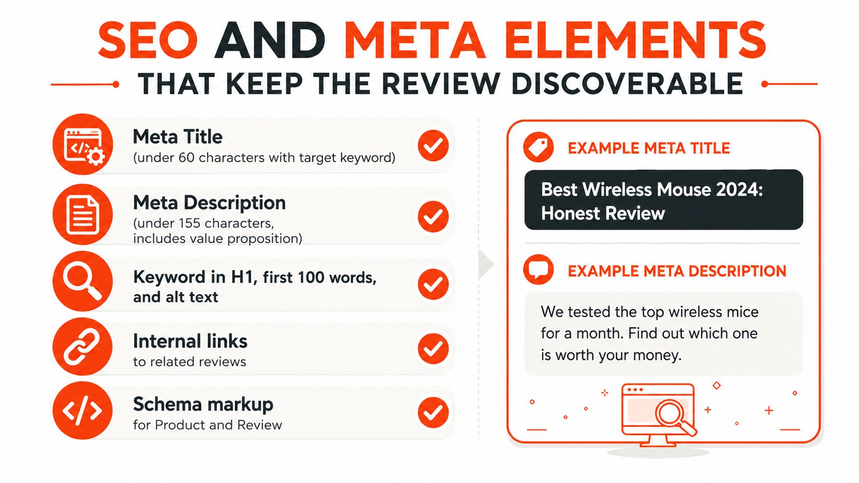
Search visibility also depends on matching the page to the search result shape. Review snippets should be written so the rating line, product name, and takeaway can stand on their own in a crowded results page. Trust signals are covered in the opening section, so use this space for the technical layer that search engines read. Keep the review page clean, annotate it properly, and let the structure do part of the discovery work.
Three Myths That Quietly Ruin Good Reviews
The most common review mistakes are usually logic mistakes. Writers keep optimizing for the wrong thing, then wonder why the page feels bloated or flat. A better format starts by dropping three habits that look safe but hurt the reader.
Myth one, longer is always better
Length helps only when the added words carry evidence. On mobile, a long intro can become a liability because the verdict appears too late. A tighter opening with a strong summary usually performs better for readers who want to decide quickly.
Myth two, every review needs every section
Not every product deserves the same depth in every block. A simple accessory doesn't need a sprawling feature analysis, while a complex SaaS tool does. Layered formatting solves that problem by giving comparison shoppers a fast path and deep researchers a longer one.
Myth three, pros and cons should always be perfectly balanced
That idea sounds fair, but it often weakens the review. Some products are clearly strong for one use case and weak for another. If the evidence leans one way, let the page lean with it.
A good review respects the product, but it respects the buyer more.
A cleaner default is easy to apply. Write the shortest version that still answers the purchase question, then expand only where the evidence changes the decision. That keeps the page sharp, and it keeps the reader moving.
Your Review Format Checklist and Next Steps
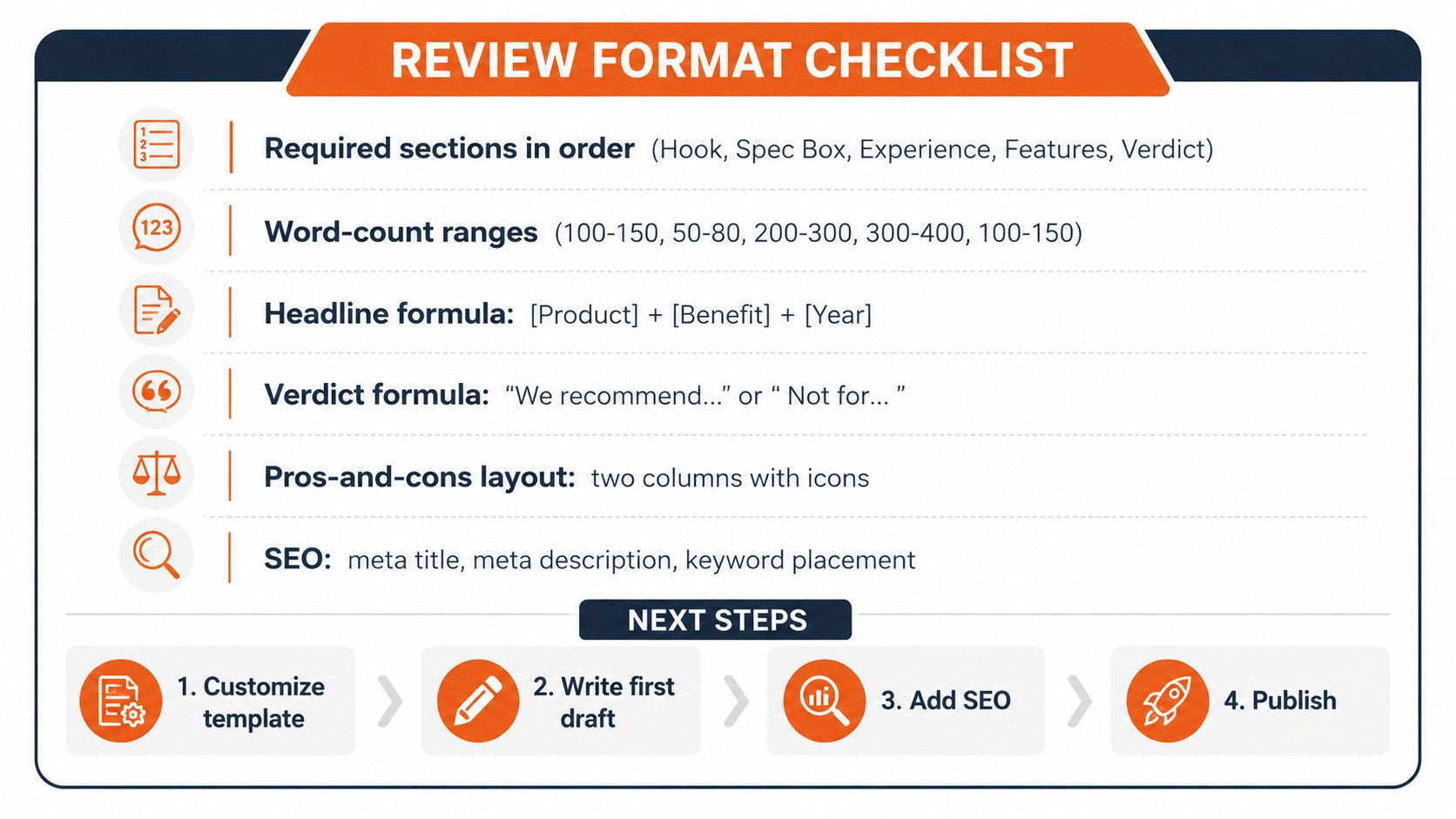
A review template is only useful if it's easy to reuse. The cleanest version fits on one screen in your editor and keeps the same order every time.
Review Format Checklist
Required sections in order. Hook, spec box, experience, features, verdict.
Word-count ranges. 100 to 150, 50 to 80, 200 to 300, 300 to 400, 100 to 150.
Headline formula. [Product] + [Benefit] + [Year] when the review is time-sensitive.
Verdict formula. “We recommend...” or “Not for...” when the buyer needs a quick answer.
Pros-and-cons layout. Two columns with icons when the page needs fast scanning.
SEO. Meta title, meta description, and keyword placement in the first pass.
For teams building a repeatable publishing system, this is also where workflow matters. A content production stack such as SupaBird's workflow guide can help you move from first draft to publish without losing the review voice.
Next steps
Customize the template. Match the depth to the reader context.
Write the first draft. Start with the verdict, then fill in proof.
Add SEO. Tune the title, description, and internal links.
Publish and refine. Watch which sections earn the most attention, then tighten the rest.
When a review format matches the reader's context, the page feels faster, clearer, and more trustworthy. That's the version worth repeating.
If you want a review workflow that keeps the structure tight while still letting you move fast, SupaBird gives creators a practical system for drafting, rewriting, and staying consistent across content. It's useful when you're turning rough notes into polished reviews and need a repeatable process that doesn't flatten your voice.

How Often Should You Tweet for Maximum Growth?

What Should Your First 10 Tweets Be About?

How to Run X for Ten Clients: The Agency Workflow

How to write a bio that gets people to follow you

Digital Product Launch Strategy

Best Twitter Growth Service for Creators in 2026

From X to Every Platform: Repurpose Without Flopping

How to Get Cited by Grok: Winning X’s AI Search in 2026

5 X (Twitter) Growth Metrics Every Serious Creator Should Track — and How to Get the Data