9 Twitter Video Best Practices for 2026
Author:

A video can earn more attention on X than plain text, yet that doesn't mean every video deserves to exist. X has reported more than 8 billion video views per day in 2024, up about 43% from the prior year, and its business guidance has stated that tweets with video can drive 10x more engagement than tweets without video. Those figures make video important, but they don't eliminate the central challenge: viewers still decide whether your clip deserves their next few seconds.
The strongest Twitter video best practices work as one connected system. You need a clear promise, a fast hook, mobile-friendly production, captions, a specific action, a consistent publishing rhythm, and a measurement loop that tells you what to change next. A viral trick might win one post. A repeatable process gives you a library of useful assets and a clearer path from attention to replies, clicks, and conversions.
Take one founder tip about reducing customer churn. Turn it into a short native video with the outcome in the opening frame, captions for silent viewing, one practical example, and a final CTA asking viewers to reply with their own retention problem. Schedule a follow-up post that expands the idea, then review completion and engagement signals before producing the next variation. Teams scaling paid distribution can also scale ad campaigns with AdStellar AI, while organic creators can apply the same production discipline without a large media budget.
Table of Contents
1. Optimize Video Length for Platform Engagement and Completion Rates
5. Use Pattern Interrupts and Visual Contrast to Stop Scrolls
8. Create Series and Recurring Video Formats for Audience Expectations
9. Repurpose Long-Form Content Into Multiple Short-Form Video Clips
1. Optimize Video Length for Platform Engagement and Completion Rates
Length should follow the promise of the video, not a habit borrowed from YouTube or podcasts. X's long-running standard upload limit for non-premium uploads has been 140 seconds, or 2 minutes 20 seconds, with a 512 MB file limit, as reflected in X's measurement documentation. That constraint created a durable best practice: communicate the core idea quickly, because a feed video needs to load, start, and deliver value before attention fades.
X's own performance language emphasizes retention rate, view rate, and completion rate. A short clip isn't automatically better, but every extra sentence creates another opportunity for the viewer to leave. A founder explaining one onboarding mistake may need a concise tip, an example, and a CTA. A product walkthrough may need more time, but it should still remove every screen, pause, and explanation that doesn't support the main outcome.
Match duration to the job
Use a short format when the viewer needs one insight, reaction, announcement, or visual demonstration. Use the full historical cap when the content needs a sequence, such as a tutorial, interview excerpt, or detailed product explanation. Longer Premium-friendly interviews and tutorials are increasingly part of the X ecosystem, but they still need chapters, visual changes, and an early reason to continue.
Try this production sequence:
Write the ending first: Decide what the viewer should understand or do before you draft the opening.
Cut repeated context: Remove introductions that explain who you are when the profile already provides that information.
Test the same idea at different lengths: Keep the promise consistent, then compare retention and completion rather than views alone.
Schedule a follow-up: Use a short clip to earn attention, then publish a deeper explanation for people who want more.
For technical guidance on the platform's historical limit, review how long a Twitter video can be. A 45-second startup tip and a 90-second SaaS demo can both work, but only when the pacing reflects the viewer's reason for watching.
2. Lead With a Compelling Hook in the First 3 Seconds
The opening frame has one job, stop the scroll. Don't begin with “Today I want to share” or a slow logo animation. Put the result, tension, question, or visual proof on screen immediately.
A founder might open with, “Our onboarding failed for one avoidable reason,” then show the specific step that caused confusion. A SaaS marketer can display the dashboard result first and rewind to the process. A coach can ask, “Why does your routine stop working after a week?” Each opening gives the viewer a reason to stay without requiring background knowledge.
Practical rule: If the viewer can't identify the promise while the first frame is visible, rewrite the opening.
Build several hook families around the same core point:
Question: “What would you remove from this landing page?”
Contrasting statement: “More features made this product harder to buy.”
Immediate demonstration: Show the successful workflow before explaining it.
Specific pain point: “Your weekly report may be hiding the bottleneck.”
Personal lesson: “I stopped chasing impressions after this happened.”
The hook must match the rest of the video. A dramatic claim followed by a generic explanation creates a retention problem, while a clear promise followed by a fast example builds trust. Add motion, contrast, or a text overlay in the first frame, but don't turn the opening into visual noise.

Write several versions before recording. SupaBird's guide to writing hooks can help generate angles, but your audience's retention and replies should decide which opening becomes a repeatable format.
Use the video below as a prompt for evaluating pacing. Watch the first moments without sound and ask whether the visual sequence communicates a clear reason to continue.
3. Use Captions and Text Overlays for Sound-Off Viewing
Your video has to make sense before the viewer unmutes it. Mobile users often encounter clips in quiet environments, during a commute, or while switching between tasks. If the spoken insight disappears with the audio, your production has created unnecessary friction.
Burned-in captions provide consistent access across viewing conditions, and text overlays can carry the structure of the argument. Use captions for the spoken words, then reserve larger overlays for the central point, a product feature, a name, or the CTA. A product walkthrough might label each stage as the screen changes. A founder testimonial can display the speaker's name and company while highlighting the practical lesson.
Design for a small screen
High contrast matters more than decorative styling. White text with a dark outline is a dependable starting point, but check the result on an actual phone rather than trusting a desktop preview. Keep phrases short enough to read before the next visual change, and synchronize the text with the moment it matters, such as a reveal, warning, or punchline.
A workable caption workflow looks like this:
Transcribe first: Correct names, product terms, and technical language before publishing.
Separate emphasis from dialogue: Don't cover the screen with duplicate text and oversized graphics.
Protect interface space: Keep important words away from areas where X controls or device elements may obscure them.
Read without audio: If the narrative becomes confusing, add concise context overlays.
End with the action: Show “Reply with your question” or “Follow for the next teardown” while delivering the spoken CTA.
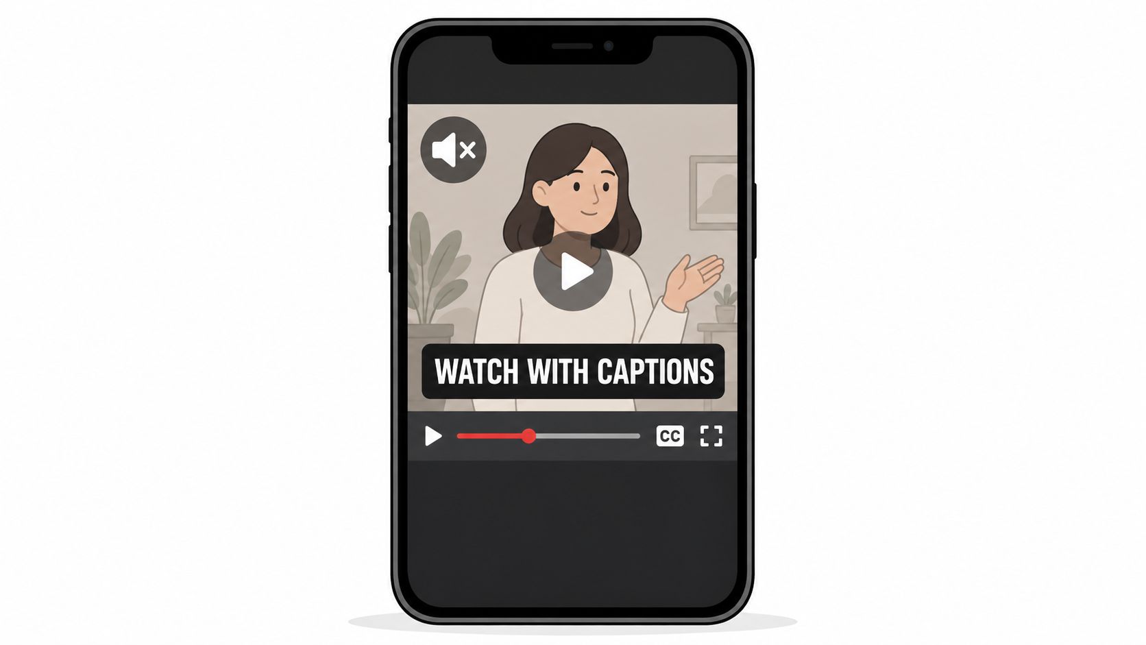
Tools such as CapCut, Kapwing, and Adobe Premiere can speed up captioning, but automation still needs a human review. A misheard product name can undermine an otherwise polished SaaS demo, and a caption that changes too quickly can lose viewers even when the video itself is strong.
4. Master Vertical Video Format for Mobile Viewing
Shoot for the device your audience uses. Portrait video gives a mobile viewer a larger subject and more immediate visual information, especially when the creator is speaking directly to camera or demonstrating a physical product. It also makes cropping decisions earlier, when they're easier and cheaper to fix.
Vertical isn't the only valid format on X. X's documented media guidance supports 1280×720 for horizontal, 720×1280 for portrait, and 720×720 for square, as summarized in this X video specifications guide. Choose horizontal when a wide interface, presentation, or group scene needs horizontal space. Choose square when you're adapting an existing asset and want a balanced compromise.
Frame before you record
A vertical-first setup doesn't mean placing a horizontal video inside a narrow canvas with empty bands. Frame the person, screen, or product to fill the portrait composition. Keep faces, demonstrations, and key labels away from the edges, and check how captions interact with the subject.
For a founder recording a vertical product walkthrough, divide the frame between the speaker and a focused screen capture instead of shrinking the entire desktop. A fitness coach can leave enough room for the full movement while keeping the instructional text readable. A marketer presenting slides should simplify each slide rather than squeezing a full presentation into portrait format.
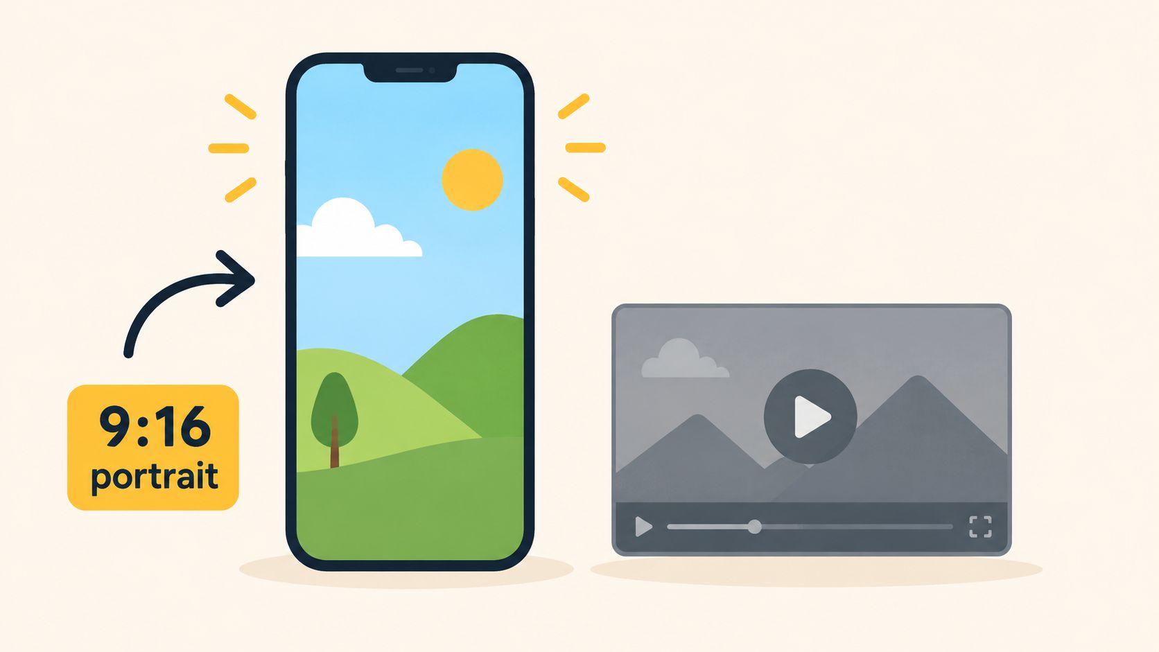
Produce a clean master file, then adapt the crop for other channels when necessary. The same workflow can support YouTube merch for enterprises, but don't let cross-platform reuse force every X video into a format that weakens its message.
5. Use Pattern Interrupts and Visual Contrast to Stop Scrolls
A pattern interrupt gives the viewer a reason to look again. It can be a cut from a talking head to a screen recording, a sudden close-up of a product detail, a change in background color, or a result shown before the explanation. The point isn't to create chaos. It's to prevent a visually flat sequence from losing attention.
A SaaS demo could begin with a dashboard alert, cut to the setting that caused it, and return to the corrected result. An indie hacker might show a failed workflow, switch to the code change, and end on the successful output. A consultant explaining a sales mistake can alternate between direct-to-camera advice and a simple on-screen example.
Create contrast with purpose
Use visual changes when they clarify the argument. A jump cut can remove a pause. A zoom can direct attention to one metric. A change from a dark background to a bright product view can signal the moment of resolution. If every sentence has a transition, the viewer has no visual hierarchy and the editing starts to compete with the idea.
Try a simple pattern-interrupt palette:
Opening contrast: Start with the most unusual frame, not a neutral setup shot.
Evidence change: Switch to a screenshot, chart, physical demonstration, or customer quote when making a claim.
Pacing change: Slow down for an important instruction, then restore momentum for the next point.
Color discipline: Use a limited visual palette so emphasis remains recognizable.
Breathing room: Let the viewer absorb the key frame before cutting again.
Don't treat an abrupt transition as a substitute for a hook. A flashy edit may win a pause, but a useful promise earns continued viewing. Review successful videos in your niche and identify where the image, angle, scale, or pace changes. Then adapt the principle to your own material rather than copying another creator's surface style.
6. Include a Clear CTA and Make It Specific
A video earns attention, then loses value if the viewer cannot identify the next step. Choose one action that fits the viewer's intent and the video's job. Replace “Engage with this” with a request such as replying, following, saving, visiting a page, or asking a question.
Match the action to the format. Educational videos can invite a follow, bookmark, or reply about a related problem. A product demonstration can send viewers to a landing page or ask which feature they want explained. A founder sharing a failed lesson can request the obstacle other builders are facing, giving the thread a clear subject.
Write the benefit into the request:
Reply: “Reply with your onboarding question and I'll cover the most common one next.”
Follow: “Follow for practical retention teardown videos.”
Visit: “Open the product page to test the workflow.”
These prompts tell viewers what happens after they act. A coach can ask, “Reply with READY if you want the accountability template.” A SaaS founder can say, “Follow for the next product teardown,” setting an expectation that the format will continue.
Use the final moments for a spoken CTA and a matching overlay. Keep one primary request on screen. Reinforce it in the post copy or a reply instead of adding competing instructions. If viewers ask questions, answer in the thread so useful responses remain attached to the video.
Measure the action tied to the goal. A reply-focused video needs reply activity, while a product video may need page visits or feature questions. Test one change per release:
Action: Compare a reply request with a follow request.
Motivation: Test curiosity, practical utility, or access to a deeper resource.
Placement: Compare an ending CTA with a brief mid-video prompt.
Audience: Use a product action for buyers and a discussion action for peers.
Review: Compare the chosen conversion signal with total views, rather than treating reach as the only result.
7. Post at Times When Your Audience Is Active
Timing affects whether a video gets an initial chance to win attention. A founder's audience may check X during work hours, while a consumer coach may reach viewers during evening downtime. Choose the publishing window around audience geography, daily routines, and your ability to join the conversation after posting.
Start with your own analytics. Identify recurring activity periods, then test nearby windows instead of treating a universal schedule as a guarantee. For audiences across regions, select an overlap that gives priority groups time to see, watch, and respond while the post remains fresh.
Make publishing part of the production checklist
A good release time is one you can support. Pricing videos may draw objections, questions, and user examples. Staying present lets you clarify the point, collect useful replies, and improve the next release. Publishing at a high-activity hour without time to respond can produce exposure without meaningful discussion.
Set up the schedule around these checks:
Audience activity: Review recurring patterns in your account data.
Time zones: Group the regions that matter most instead of chasing every location.
Reply coverage: Reserve time after publishing, particularly for launches and product demonstrations.
Scheduling: Queue routine series in advance, while leaving room for timely posts.
Comparable conditions: Compare similar formats and goals, not isolated videos with different purposes.
A creator with a global audience might schedule one founder tip for a European morning and another for a North American workday. Compare completion, replies, and clicks across those releases. A B2B marketer can test weekday windows, while a coach can compare workday and weekend behavior and keep the result open until the data supports a choice.
Record the winning window with the format, audience, and reply plan. Revisit it when your audience mix or publishing capacity changes. Use the best time of day to post on X in 2026 as a planning reference, then let your audience data and capacity to engage make the final decision.
8. Create Series and Recurring Video Formats for Audience Expectations
A series gives viewers a clear reason to recognize and revisit your videos. “Startup Sunday” can deliver one founder lesson, while “Growth Metrics Monday” answers one recurring marketing question. The title does not need to reference a day, but every format needs a stable promise, visual identity, and publishing rhythm.
Choose a container that matches the work you already do. An indie hacker can explain one product decision per episode. A marketing manager can review one competitor landing page in each release. These boundaries reduce planning time and make the next topic easier to select.
Design the production checklist first
Write a short outline for every episode: hook, one idea, proof or example, and CTA. Keep the opening recognizable with a repeated title card, camera setup, or caption treatment. Consistency helps viewers identify the series, while small visual or editorial changes prevent the feed from feeling copied.
Build a small mix of formats:
Core education: Answer one recurring audience problem.
Proof and examples: Show teardowns, demonstrations, or lessons from current work.
Community format: Respond to viewer questions, replies, or reactions.
Product format: Explain one feature or use case at a time.
Experimental slot: Test topics or editing styles that could become a regular series.
Batching supports a reliable publishing rhythm, but review each release before scheduling the next batch. Near-identical clips weaken attention when they add no new insight. Change the angle as audience questions develop, and retire a format when it stops producing useful conversations. Track each series separately, including views, completion, replies, and clicks, so a strong account average does not conceal a weak concept.
Use the next episode as the follow-up. End one video by naming the question you will answer next, then deliver that answer in the following release. This creates continuity without artificial suspense, and the results from each episode show which format deserves more production time.
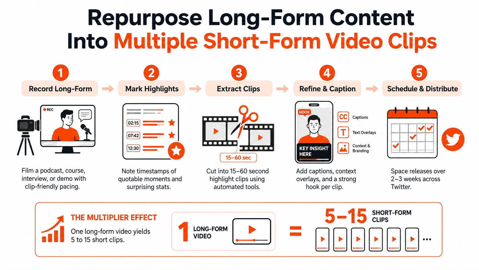
9. Repurpose Long-Form Content Into Multiple Short-Form Video Clips
One long-form recording can supply a week of focused Twitter videos, if each clip earns attention on its own. A podcast, webinar, course lesson, or product interview should be treated as source material, not as one video to compress. Select moments that are surprising, immediately useful, emotionally clear, or easy to demonstrate.
A founder interview might become separate clips about a failed launch, customer research, and pricing. A SaaS demo can produce one video per workflow. That approach removes viewing friction because each viewer receives one clear lesson instead of a rushed product tour.
Build clips around a repeatable extraction process
During recording, leave clean pauses and finish complete thoughts so editors can isolate usable sections. Mark strong moments as they happen, then review each selection for context, accuracy, and a clear opening. Remove phrases such as “as I said earlier,” identify speakers, credit guests, and preserve the meaning of trimmed quotes.
Use this production-to-measurement checklist:
Select one lesson: Choose a moment that solves a specific viewer problem.
Write the context: Add an opening headline that explains why the clip matters to someone unfamiliar with the source.
Package for the feed: Test different hooks, captions, crops, or opening frames while keeping the underlying lesson consistent.
Remove viewing friction: Make the clip understandable without the full conversation and check that the text remains readable on mobile.
Schedule the library: Release related clips across a planned period instead of exhausting the source in one burst.
Measure and refine: Compare views, completion, replies, and clicks by clip. Keep openings and topics that earn continued attention, then revise weaker cuts.
Connect the next action: Direct interested viewers to the full conversation, a related clip, or a specific follow-up.
A consultant can turn one training session into practical answers. A product team can turn customer interviews into problem-focused clips, then create follow-ups from recurring questions. SupaBird's content repurposing strategy outlines how to turn source material into a broader publishing system.
9-Point Comparison of Twitter Video Best Practices
Strategy | Implementation complexity | Resource requirements | Expected outcomes | Ideal use cases | Key advantages |
|---|---|---|---|---|---|
Optimize Video Length for Platform Engagement and Completion Rates | Medium, requires testing optimal duration | Basic editing, analytics tools, time for A/B tests | Higher completion rates and improved distribution (best at 30–45s) | Short tips, demos, promotional clips | Balances value with attention; boosts algorithmic reach |
Lead with a Compelling Hook in the First 3 Seconds | Medium–High, needs scripting and creative iteration | Storyboarding, copywriting, short-form editing | Significantly higher early engagement (≈30–50%) and retention | Any feed-facing content competing for attention | Dramatically increases scroll-stops and watch-through |
Use Captions and Text Overlays for Sound-Off Viewing | Medium, add caption workflow to production | Captioning tools (Kapwing, Descript), design time | Higher engagement (+≈40%), better accessibility and shareability | Mobile audiences and noisy environments | Ensures message lands with muted playback; improves inclusivity |
Master Vertical (9:16) Video Format for Mobile Dominance | Low–Medium, change framing and shoot style | Vertical shooting, framing guidelines, vertical-capable editors | Much higher on-screen presence and completion (60–80% lift reported) | Mobile-first short-form, Reels/Shorts repurposing | Fills screen, reduces friction, improves algorithmic performance |
Leverage Pattern Interrupts and Visual Contrast to Stop Scrolls | High, advanced editing and creative planning | Motion/graphics tools, editing skill, creative testing | Strong increases in scroll-stop and initial engagement | Viral clips, launches, surprising reveals | Breaks feed monotony; boosts immediate attention and shareability |
Include a Clear Call-to-Action (CTA) and Make It Specific | Low, copy + placement discipline | Copywriting, on-screen text, link management | More interactions and conversions (+20–40%) | Conversion-focused videos, lead capture, community growth | Converts viewers into measurable actions; guides next steps |
Post at Optimal Times When Your Audience Is Active | Low–Medium, requires audience analysis | Analytics, scheduling tools (SupaBird, Buffer) | Higher first-hour engagement (can increase 60–100%) and reach | Time-sensitive posts, global audiences, product launches | Maximizes early momentum to trigger algorithmic boost |
Create Series and Recurring Video Formats for Audience Expectations | Medium, planning and consistent production | Calendar, branding assets, batch production | Predictable engagement, stronger follower retention | Educational series, themed weekly shows, founder routines | Builds habit, simplifies planning, improves long-term loyalty |
Repurpose Long-Form Content Into Multiple Short-Form Clips | Medium, editing and curation workflow | Editing tools, timestamps/notes, automation (AI clip tools) | Multiplies content output and reach; more chances for viral hits | Podcasts, webinars, long demos, interviews | Efficient content reuse; steadier publishing cadence and discovery |
Turn the Checklist Into a Repeatable Video System
The nine practices work best as a production-to-measurement loop, not as isolated optimizations. Start with the viewer's problem and define the promise in one sentence. Then write an opening that makes that promise visible immediately, choose a duration that fits the idea, and plan the final action before you record.
Production should remove viewing friction. Frame for mobile, use the appropriate horizontal, portrait, or square dimensions, encode with a supported format, and check the finished file on a phone. X's media guidance recommends H.264 High Profile with AAC LC audio, along with 1280×720 for horizontal, 720×1280 for portrait, or 720×720 for square. It also recommends a minimum 5,000 kbps video bitrate and 128 kbps audio bitrate, according to this media specification guide. X's developer documentation also recommends 30 FPS or 60 FPS, which can help preserve smooth motion when the source footage supports it.
Captions should carry the essential meaning without turning the screen into a paragraph. Add one clear CTA, publish the native upload at a time your audience can reasonably watch, and stay available to answer early questions. For advertising, X's business guidance recommends 15 seconds or less, while uploads up to 2 minutes 20 seconds are supported, so create a shorter performance cut when the goal is paid response and reserve longer edits for organic education or narrative content. You can review X's advertising analytics guidance when aligning creative with campaign measurement.
Review the signals that match the goal
Views tell you that the video started, not that it delivered value. Compare retention, view rate, and completion when you're improving structure. Compare replies when you're building conversation, clicks when you're moving people to a product page, and follows when you're developing a recurring audience. The best metric depends on the job of the post.
A weekly review can stay simple:
Length: Where did viewers stop watching, and did the duration fit the promise?
Hook: Which opening earned continued viewing or meaningful replies?
Captions: Could the idea be understood without sound?
Format: Did the framing make the product, person, or demonstration easy to see?
Timing: Were you available to participate after publishing?
CTA: Did the requested action match the audience's intent?
Series: Which recurring format deserves another episode?
Repurposing: Which clip can become a new video, reply, or text post?
One important trade-off deserves its own rule. Video can be a powerful reach and interaction format, but it isn't always the best choice for every message. One 2026 analysis reported video X posts averaging a 1.34% engagement rate, with a 0.94% median, while another study headline argues that text-only posts can outperform video on engagement-focused metrics, as summarized in this analysis of X engagement rates. Use that evidence as a reason to test, not as a universal verdict. A concise text post may beat a video when the idea is a sharp opinion, searchable explanation, or conversation prompt that doesn't benefit from motion.
The modern decision is also about distribution. Native uploads generally fit the feed experience better than pasted external links, while longer Premium-friendly tutorials and interviews can serve audiences that want depth. Choose the format according to the intended outcome, then measure the outcome directly. Recent guidance on posting and optimizing Twitter videos in 2026 discusses this shift toward native media, mobile viewing, watch time, and reply-heavy engagement.
SupaBird can support parts of this operating system through Ideas Lab for format development, X-GPT for hook and draft rewrites, a calendar for scheduling, Engage for finding conversations, X Coach for feedback, and video-to-post transformations for reuse. Those tools can reduce production friction, but they can't decide whether your audience wants a demo, a story, a text post, or a direct answer. Keep testing the audience-specific variables yourself.
Start with one repeatable format this week. Produce a native clip, caption it, publish one specific CTA, record the relevant performance signals, and create a second version based on what viewers did. That process will teach you more than chasing a generic ideal length or copying a viral edit.
Use SupaBird to generate video ideas, rewrite hooks, schedule releases, find relevant X conversations, and turn source videos into posts you can reuse. Try it as a practical companion to this checklist, then keep the decisions grounded in your own audience's viewing, reply, click, and conversion data.

The Reply Guy Strategy: A Growth Guide for X

Why New X Accounts Get Less Reach

ClimbX Review (2026): Features, Pricing, Pros and Cons

How Developer Startups Build a Brand on X Before Launch

30-Day Starting Plan for New X (Twitter) Accounts

How Often Should You Tweet for Maximum Growth?

What Should Your First 10 Tweets Be About?

How to Run X for Ten Clients: The Agency Workflow

How to write a bio that gets people to follow you
